Here is a selection of writing published in the last few years.
A complete list of stories can be found here.


Since earlier in the year, I’ve been reporting off and on about digital privacy – there’s more than enough material. Most recently I looked at the OKCupid data scraped in May, and how exposed it left the people who had signed up for that dating service.
- 1,800 Canadians’ secret OKCupid data exposed
- Reality check: You don’t need RFID protection in your wallet
- Internet of Things our ‘biggest threat to privacy,’ expert warns
- How does Linkedin choose the people it thinks you should know?
- What drivelikeagirl.com tells us about the future of your digital privacy
- Does your phone help build Google’s traffic maps? (And is that bad?)
- Every move you make: Privacy expert wary as insurers track drivers
- What a map we can’t show you tells you about your phone’s location settings
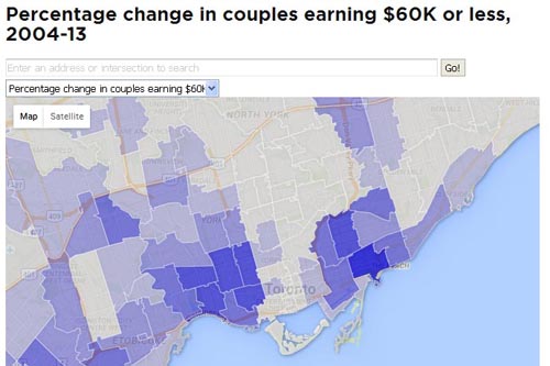
For a series on real estate, I mapped gentrification using tax data based on postal codes, comparing 2004 to 2013. The theory was: if low-income tax filers were vanishing from a postal area, it would indicate a pattern of gentrification in the period we were looking at. The Toronto map made intuitive sense (we looked at Toronto and Vancouver). The map shows the historic mixed-income neighbourhoods of the city’s east and west ends getting much less mixed-income over the decade.
Low- and middle-income families vanish as urban neighbourhoods gentrify
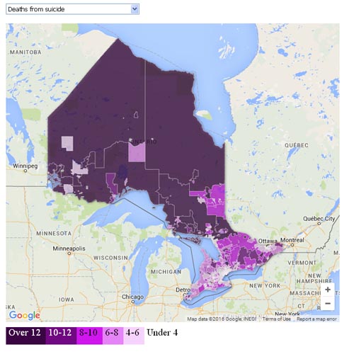
Attawapiskat’s suicide emergency is no surprise to anyone paying attention
For a story on the public health crisis in native communities in northern Ontario, we used maps showing causes of death and premature death to visualize the problem from several different angles.
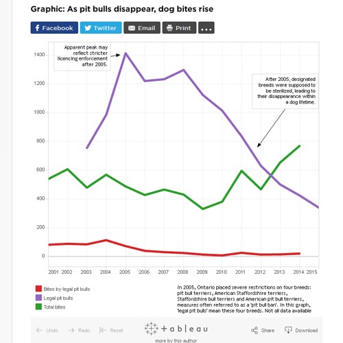
Toronto’s pit bulls are almost gone. So why are there more dog bites than ever?
Ontario’s controversial ban on pit bulls, enacted more than a decade ago, was supposed to reduce the number of dog bites. It didn’t work out that way, City of Toronto bite statistics show.

Interactive maps: In Ontario, 20 unpredictable races to watch
I illustrated our regional setup stories for the 2015 federal election with poll-level interactive maps of the 2011 election. For the Ontario one, which depicts about 24,000 polls, it was challenging to create a map that loaded smoothly. In the end, I created a map which drew on four different Fusion Tables maps on the back end.

The leak of the Ashley Madison user data in August, 2015 created technical challenges because of the size of the databases, and also ethical challenges in how it could be used. We used the leaked data for several exclusive stories.The data included geotags created by users’ mobile devices which showed, often contrary to their claims, that over 1,200 were men seeking men in conservative countries where same-sex activities are harshly punished.

Investigation: Slowly, Toronto firefighters become more diverse
Toronto’s population is 49 per cent visible minorities, but its fire department is over 96 per cent white, something that only recently attracted controversy. We used data on the postal codes of successful fire department applicants to show that Toronto firefighters have mostly been hired from areas outside the city with few immigrants and visible minorities. In the process, we produced the first really thorough look at race and firefighting in Toronto.

Chequed out: Inside the payday loan cycle
Maps show how cheque-cashing outlets are placed in census tracts with low income and high welfare rates. Once the maps made the connection impossible to deny, we could move on to a discussion of why it exists.

CBSA learned of its own detainee’s death by accident – three weeks later
This is not obviously a data story, but is in the background: it started life with a database related to immigration detention that we requested under access-to-information laws, and followed up with further access requests about specific custody deaths. The end result was a story about how border officials lost track of a detainee to the point of not knowing about his death, in a local jail, until three weeks after it had happened. It is part of a larger series on immigration detention in Canada.

Toronto taxi licence prices are plummeting. Is Uber to blame?
We used a database of Toronto taxi licence prices obtained under access-to-information laws to show how the value of taxi plates has collapsed since Uber entered the local taxi market. In the process, we ventured into Toronto’s tangled, thorny taxi politics.
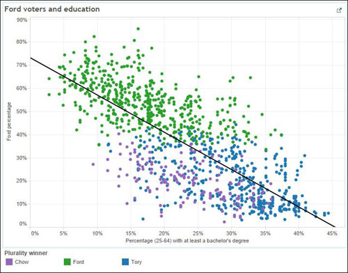
Ford Nation 2014: 14 things demographics tell us about Toronto voters
Poll-level maps show Toronto’s election in extreme detail
Local elections in Toronto in October ended Rob Ford’s long, troubled tenure as Toronto’s mayor. After the vote, we produced detailed poll-level maps looking at the plurality winner by poll, and a series of scatterplot graphs mashing up demographic data with the election results:

We used Toronto traffic charge data and an accident database obtained under access-to-information laws to look at ‘dooring’ accidents involving cyclists: where the city’s worst areas are (and why) and questioning why many incidents didn’t result in charges.
INTERACTIVE: Why College Street is Toronto cyclists’ ‘dooring zone’
Then, we looked at similar data for Vancouver, which shows that police there seldom use British Columbia laws on the books to charge drivers after cyclists are doored.
People seldom charged when cyclists get ‘doored,’ Vancouver data shows
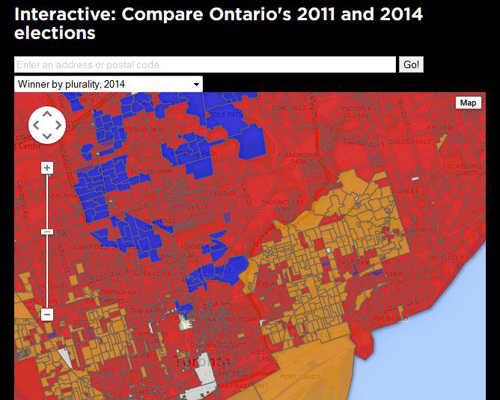
What 24,903 polls taught us about Ontario’s shifting political landscape
Your guide to Ontario’s political polarization (have fun governing that)
We plugged demographic data from the census into the results of a provincial election in Ontario, creating a series of scatterplot graphs looking at political choice in relation to a number of factors including education, commuting mode (car vs. transit), immigration and income. We also used Fusion Tables to map results from the province’s 24,903 polling stations on a one-stop-shop map, with a similarly detailed map of the 2011 election for contrast. The maps also showed each party’s support broken out separately.
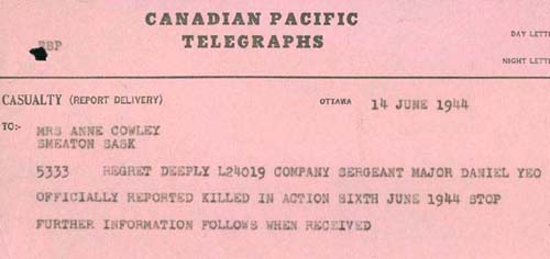
Mapping Canada’s D-Day dead
We mapped Canada’s D-Day casualties down to the household/community level, tracing addresses through contemporary newspaper reports, historians, previous overlapping research, reader contributions and online resources. Of 388 Canadians and Newfoundlanders who died on the first day of the landings, we were able to trace at least a partial next-of-kin address for all but 15.
Here’s the sex offender map Ontario didn’t want you to see
Related stories:
Unanimous Supreme Court decision ends six-year FOI ordeal
Sex offender case a ‘colossal waste of money’: Tory jail critic
Following a six-year legal battle that ended in the Canadian Supreme Court, we published a map of Ontario’s registered sex offenders broken down by partial postal codes. By then, the process of getting the data had long since eclipsed the data itself as a story.
Canadian three-character postal ‘forward sortation areas’ have populations in the tens of thousands, making them large enough to protect the anonymity of a few individuals. The map struck a balance between showing geographic patterns and not endangering individuals. For registered sex offenders, which have been attacked in other jurisdictions, this was a particular concern. The Supreme Court decision, which was unanimous, changed an aspect of Canadian freedom-of-information law which has to do with the burden of proof that has to be met by government bodies wanting to use a law-enforcement exemption. The story won an RTDNA award.

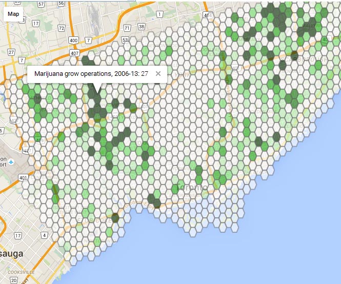
Toronto’s vanishing grow-ops fall victim to pot economics
We looked at police data obtained under access-to-information laws showing a sharp drop in marijuana grow operation busts in Toronto, and explained how it was connected to the fall in marijuana prices in the United States. Behind the data were addresses of about 1,400 grow ops requested from Toronto police under access-to-information laws. The story featured a hex map, one way around the legal and practical problems of displaying all 1,400 points.

Sun in your eyes: ‘Torontohenge’ sees accidents spike
“Torontohenge,” when the setting sun aligns with Toronto’s east-west street grid and forces drivers to squint through salt-crusted windshields, coincides with the third-worst day of the year for car accidents, data shows.
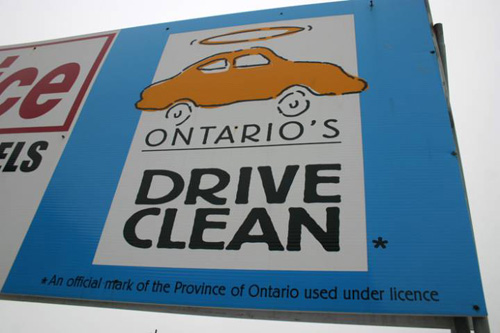
Exclusive: Newer cars almost never fail Drive Clean. Why keep testing them?
Almost no one fails Drive Clean. But it’s needed anyway, Wynne argues
Nearly all recent car models pass their Drive Clean tests, Ontario government data shows. The story called the point of the mandatory testing program into question. The government defended it, but later dropped the $30 fee. The story won an RTDNA award.
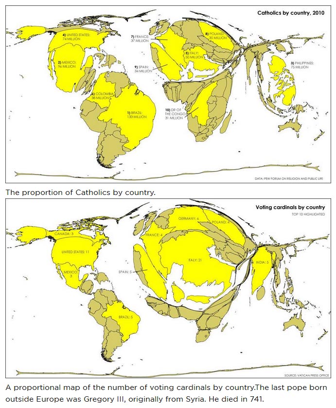
My first cartogram map was made for the last papal election. It shows the disparity between voting cardinals and the distribution of Catholics.
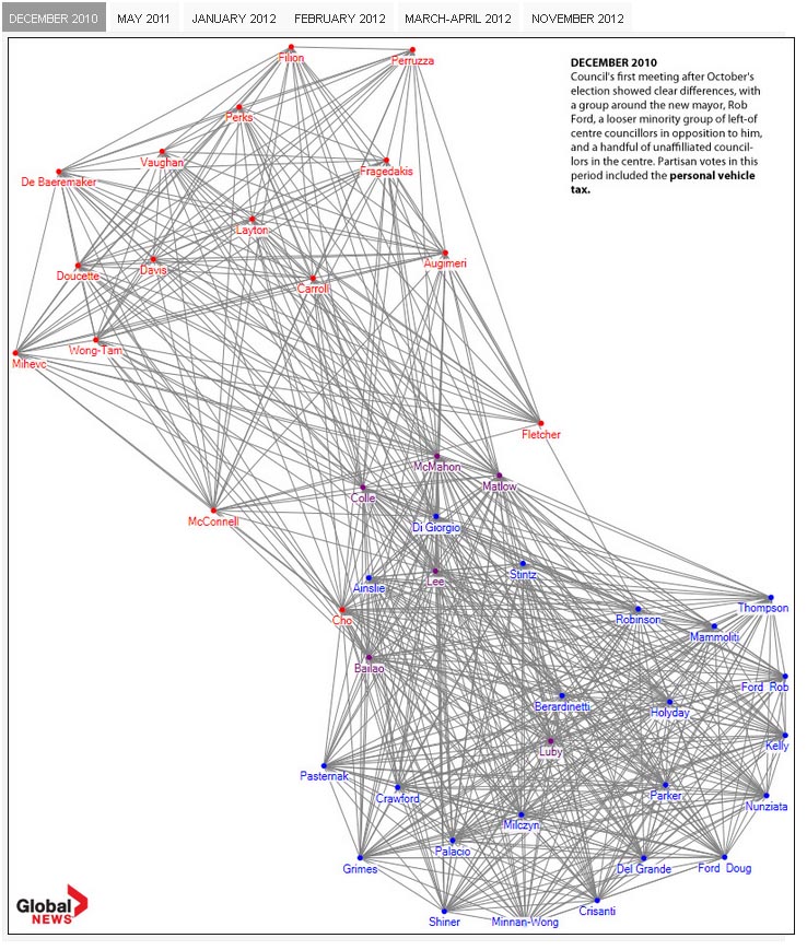
This visualization of voting patterns in Toronto’s city council in the early Rob Ford years using NodeXL was modeled to an extent on this relational diagram of U.S. Senate voting patterns. Parliamentary government doesn’t lend itself to very interesting voting diagrams, but municipal councils can. The diagrams, which show the likelihood of any given councillor voting with any other given councillor, show the breakup of the once-tight group of councillors supporting Rob Ford. Click on the image for an interactive version.