Data, maps and other visualization tools – scatterplots, interactive calendars – have a natural relationship. The right image lets you both show and tell, and interactivity lets the reader explore the richness of the information presented.


During the 2018 Ontario election, as cannabis legalization loomed, PC leader Doug Ford condemned the then-Liberal government for allowing a proposed cannabis store about 300 metres from an elementary school.
The problem, though, is that while Toronto is big, it also has lots and lots of schools. And if you start drawing radiuses around all of them where cannabis stores aren’t allowed to be – and then look at zoning – it’s hard to see what parts of the city are left that they could be squeezed into.
The maps worked well on TV, as you can see in the embedded video.
If cannabis stores must be far from city schools, where do we find room for them?
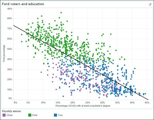
Local elections in Toronto in 2014 ended Rob Ford’s long, troubled tenure as Toronto’s mayor. After the vote, we produced detailed poll-level maps looking at the plurality winner by poll, and a series of scatterplot graphs mashing up demographic data with the election results. This was a complex project on the back end, since the polls had to be associated with census tracts. Much like the census maps discussed below, it was only possible as a same-day project with a lot of prior preparation.
Ford Nation 2014: 14 things demographics tell us about Toronto voters
In The Truthful Art: Data, Charts, and Maps for Communication, Alberto Cairo described the charts as “striking”.

I illustrated our regional setup stories for the 2015 federal election with poll-level interactive maps of the 2011 election. For the Ontario one, which depicts about 24,000 polls, it was challenging to create a map that loaded smoothly. In the end, I created a map which drew on four different Fusion Tables maps on the back end.
Interactive maps: In Ontario, 20 unpredictable races to watch

Leslie Young and I used Google Fusion Tables to map the 2011 census results at the tract level as they were released. In this case we didn’t have the luxury of time that is nice with complex projects, but after careful preparation and rehearsals it went pretty smoothly. Over time, we created dozens of national tract-level census maps, all published the day of the data release. The map below was the final one in the series, a map of non-official languages called Crayon Box Nation. (Montreal is shown.)
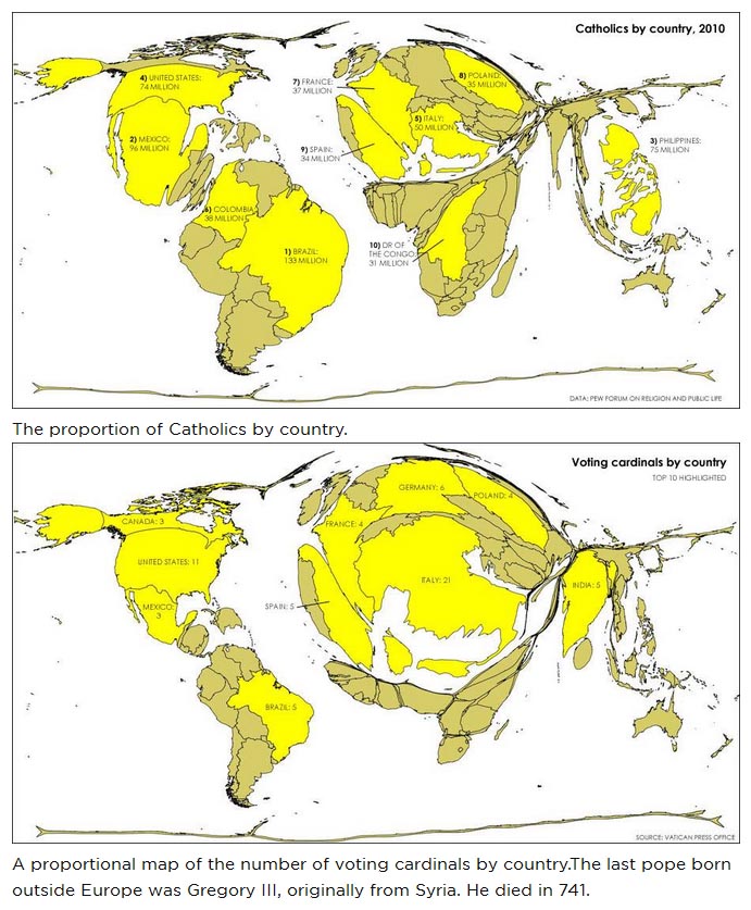
My first cartogram map was made for the last papal election. It shows the disparity between voting cardinals and the distribution of Catholics.
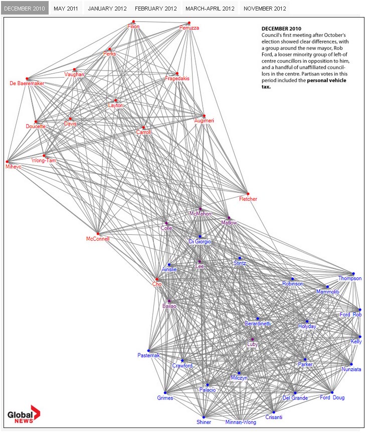
This visualization of voting patterns in Toronto’s city council in the early Rob Ford years using NodeXL was modeled to an extent on this relational diagram of U.S. Senate voting patterns. Parliamentary government doesn’t lend itself to very interesting voting diagrams, but municipal councils can. The diagrams, which show the likelihood of any given councillor voting with any other given councillor, show the breakup of the once-tight group of councillors supporting Rob Ford. Click on the image for an interactive version.
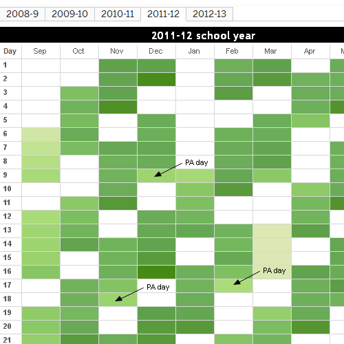
For time-based data, interactive calendars can be an excellent way to see patterns. This calendar of teachers’ sick days shows a strong pattern of calling in sick on Fridays.
Interactive: Is your teacher off sick? It’s probably Friday
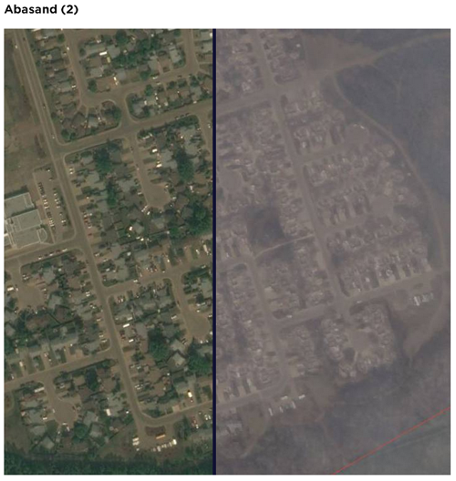
As the Fort McMurray wildfire receded (but not before the smoke had cleared, as you can see) satellite images started to become available. I stretched them over Fort McMurray in Google Earth until the image matched the base geography, screenshotted with and without the overlay, and produced a set of before-and-after slider images.
Fort McMurray wildfire: First clear satellite images show deserted streets, burned homes
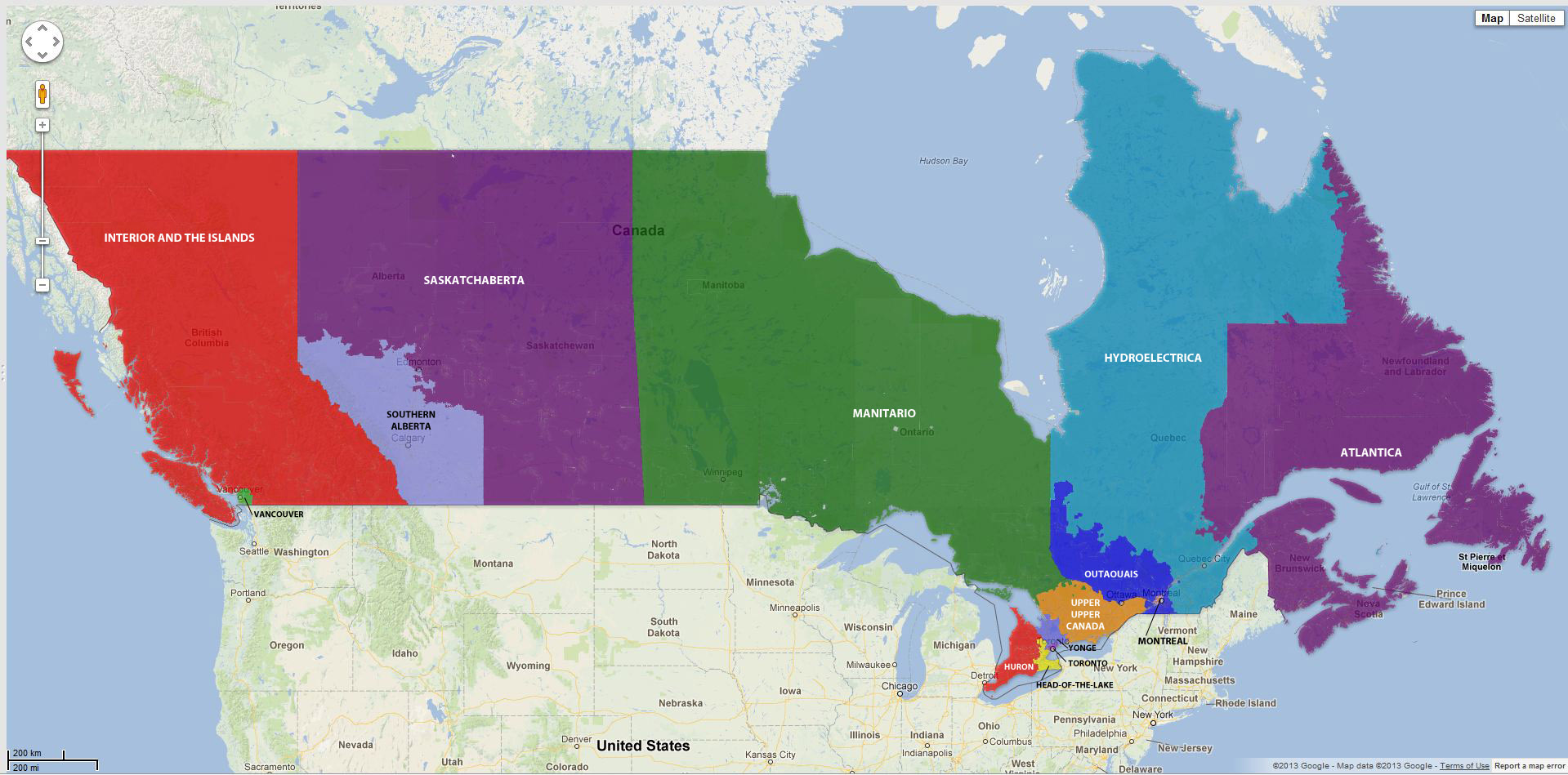
Canada’s provinces vary greatly by population. But what if they didn’t? To find out, I built this map breaking up the country into 14 provinces more or less equal by population, from Saskatchaberta to Hydroelectrica, and points in between.
Canada remapped as 14 provinces of (more or less) equal populations