I’ve been messing around with data journalism for years, and think I’ve only started to explore the possibilities. Here are some highlights of the past few years.


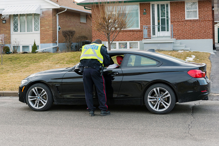
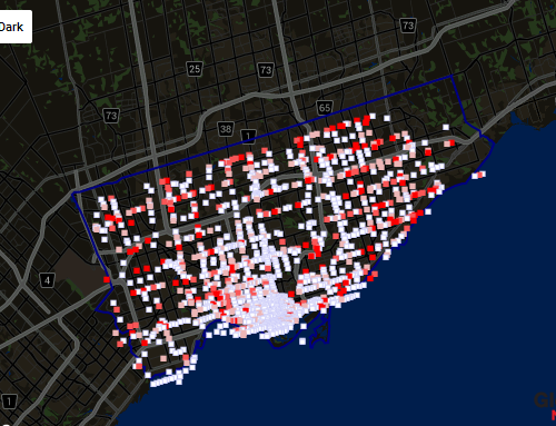
Starting in 2012, Toronto police started writing fewer and fewer traffic tickets for things like speeding and blowing a stop sign. Why? It depends to you ask: critics said it was payback for city budget cuts to the police, and that the $30 million in lost ticket revenue more or less balanced out the cuts. A little-discussed side effect of the drop in tickets, though, was that the TPS suddenly started charging many fewer drunk drivers. Was that because there were fewer to charge? Forces in the 905 didn’t see a corresponding drop.

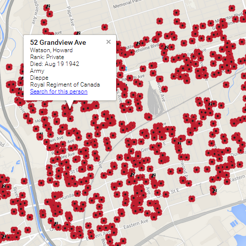
For much of 2010, I was a contributing editor at openfile.ca, where my Poppy File project, which mapped Toronto’s Second World War deaths at the household level, won a Canadian Online Publishing Award and was shortlisted for an Online News Association award and a National Magazine Award.
OpenFile is no longer with us, but the map can be seen here. Since then, I’ve created First World War versions for Toronto, Winnipeg and Vancouver, and national maps for D-Day and Korea.
In Facts are Sacred, Simon Rogers described the Poppy File maps as “the pinnacle of what data journalism is supposed to be about.”

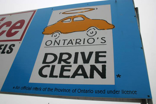
Nearly all recent car models pass their Drive Clean tests, Ontario government data shows. The story called the point of the mandatory testing program into question. The government defended it, but later dropped the $30 fee. The story won an RTDNA award.
Exclusive: Newer cars almost never fail Drive Clean. Why keep testing them?
Almost no one fails Drive Clean. But it’s needed anyway, Wynne argues
The leak of the Ashley Madison user data in August, 2015 created technical challenges because of the size of the databases, and also ethical challenges in how it could be used. We used the leaked data for several exclusive stories. The data included geotags created by users’ mobile devices which showed, often contrary to their claims, that over 1,200 were men seeking men in conservative countries where same-sex activities are harshly punished.
Where 1,296 gay Ashley Madison users face prison, flogging, execution


The economic benefits of casinos to communities can be debated, but data from Ontario’s lottery authority clearly shows another side of the story – all over the province, people with such a serious gambling problem that they volunteer to be charged with trespassing if they set foot in a casino are concentrated around casinos. It clearly implies that for some residents, the arrival of a casino led to their developing a gambling problem that they might otherwise have avoided.
The downtown Windsor postal code that houses the mammoth Caesar’s casino is also home to 248 self-excluded gamblers, which is just over 1 per cent of the population. In Windsor, self-excluded gamblers cluster around the casino site, with fewer of them found the further you get from downtown.
Across Ontario, desperate problem gamblers surround casinos
This story won a regional RTDNA award.


In 2011, I mashed up the City of Toronto accident database with pedestrian counts to come up with a list of the city’s most dangerous intersections for pedestrians. The story led to several intersections being redesigned (though not the ones we wrote about).
The accident database was a rich source of story ideas:
Careful, last-minute shoppers: This is the worst week of the year for Toronto car crashes
Why do Toronto pedestrian accidents peak at the end of November?
Global News investigation sparks city plan for safer pedestrian intersections
Interactive map: Is sleepy Scarborough intersection the city’s most dangerous?
Fall daylight savings time correlates to a spike in pedestrian injuries
City committee to discuss dangerous pedestrian intersections
Toronto city councillor urges action on dangerous intersections


